- 프롬프트 연구소
- 이미지 프롬프트
- 엽서·일러스트
여행지 건축 엽서 이미지 프롬프트
장소 이름만 넣으면 펜 선화와 고지도 디테일이 어우러진 세로형 건축 엽서 이미지를 만드는 프롬프트입니다. 서울 명동성당으로 만든 실제 결과를 함께 보여 드립니다.
- 완성 목표
- 장소 하나로 만든 세로형 건축 엽서 이미지 1장
- 이럴 때 사용하세요
- 여행 기록, 굿즈 시안, SNS 카드 배경처럼 감각적인 일러스트 한 장이 필요할 때
- 준비물
- 이미지를 만들 수 있는 AI 도구(ChatGPT, Gemini 등)
- 사용법
- 아래 빈칸에 장소와 현지 표기를 적고, 완성된 프롬프트를 복사해 이미지 생성 AI에 붙여 넣으세요.
장소 이름 하나만 바꾸면, 서점이나 미술관 기념품 가게에서 발견할 법한 건축 엽서가 나옵니다. 이 프롬프트는 여행지의 대표 건축물 한 곳을 골라 가는 펜 선으로 그리고, 중요한 면에만 몇 가지 색을 입히고, 배경에는 옛 지도와 도면 조각을 옅게 깔도록 요청합니다.
원작 프롬프트: 이 프롬프트는 Threads @ai_traveler_k 님이 만든 것입니다. 원작자의 다른 작업도 함께 구경해 보세요. 이 글의 결과 이미지는 빈칸랩이 같은 프롬프트로 직접 다시 만들어 본 것입니다.
실제로 만들어 본 결과
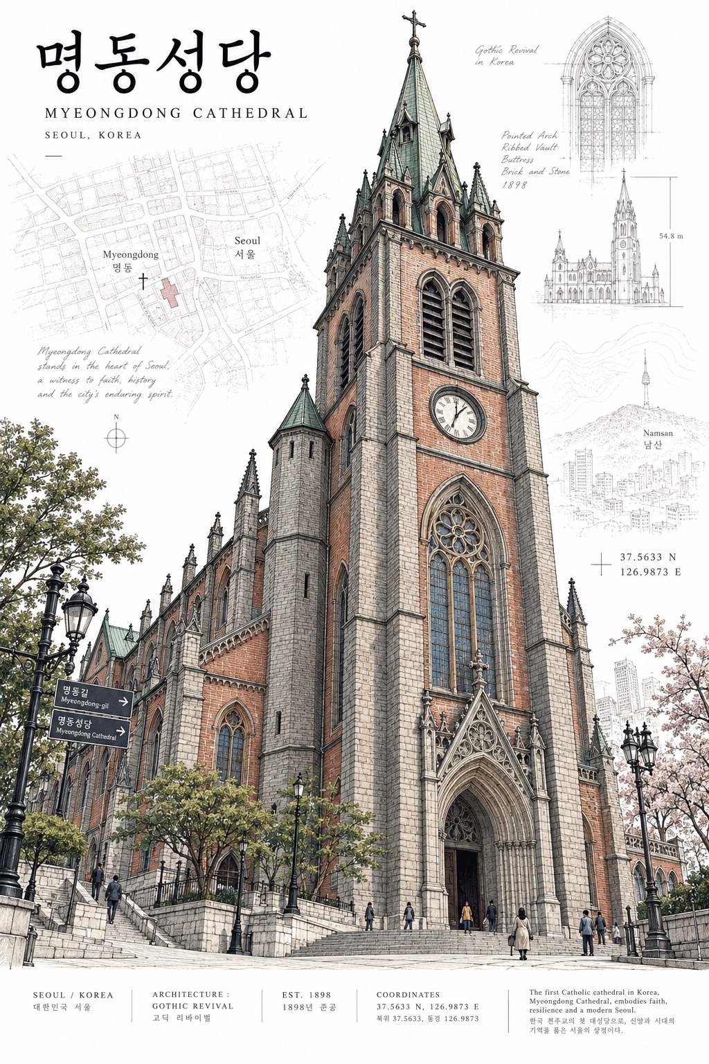
결과에서 프롬프트의 요구가 어떻게 드러나는지 살펴보세요.
- 주인공 건물 하나: 명동성당의 고딕 첨탑이 화면의 대부분을 차지합니다. 여러 명소를 한꺼번에 넣지 않습니다.
- 선화 + 선택적 색: 벽돌은 붉은색, 석재는 회색, 지붕은 청록으로만 칠하고 나머지는 선으로 남깁니다.
- 흰 배경 위의 자료 조각: 지도, 좌표, 손글씨 메모가 옅게 깔려 건물을 방해하지 않습니다.
- 작은 글자 띠: 위쪽 제목과 아래쪽 정보 띠가 카탈로그 같은 분위기를 만듭니다.
이렇게 사용하세요
- 아래 빈칸에 장소(DESTINATION)와 현지 표기(LOCAL NAME)를 적습니다. 예: 서울 명동성당 / 명동성당
- 완성된 프롬프트를 복사해 이미지를 만들 수 있는 AI 대화창에 붙여 넣습니다.
- 결과가 마음에 들지 않으면 아래 방법으로 한 줄만 바꿔 다시 시도해 보세요.
- 건물이 마음에 안 들 때:
MAIN SUBJECT부분에 원하는 건물 이름을 직접 적습니다. - 색이 아쉬울 때:
COLOR부분의 색 이름을 장소에 어울리는 색으로 바꿉니다. - 글자가 어색할 때: 이미지 속 글자는 AI가 잘못 쓰는 일이 많으므로 확인하고, 필요하면 편집 도구에서 고칩니다.
- 건물이 마음에 안 들 때:
빈칸을 비워 두면? 프롬프트 속
[DESTINATION],[LOCAL NAME]글자가 그대로 남습니다. 그 상태로 보내도 AI가 알아서 장소를 고르지만, 원하는 장소가 있다면 꼭 채우세요.
출처
- 원작자: Threads @ai_traveler_k
- 결과 이미지: 빈칸랩이 위 프롬프트로 명동성당을 넣어 생성했습니다.
첫 질문, 바로 복사해 보기
01
내 상황으로 완성하기
빈칸을 채우면 아래 프롬프트에 자동으로 반영됩니다.
02
완성된 프롬프트
빈칸을 안 채워도 복사할 수 있어요.
DESTINATION: [DESTINATION]

Create a sophisticated vertical architectural travel postcard for [DESTINATION].

The artwork should feel like a beautifully designed collectible postcard discovered in an independent bookstore, museum shop, or premium stationery store.

OVERALL AESTHETIC
Combine:
- precise architectural ink illustration
- restrained vintage travel graphics
- contemporary editorial design
- subtle cartographic and archival-document details

The result should feel intelligent, cultured, architectural, and collectible — not like a conventional tourist souvenir.

MAIN SUBJECT
Choose ONE iconic building, monument, street façade, or architectural structure that strongly represents [DESTINATION].

Make this single landmark the clear visual hero.

Show it from a slightly dramatic but believable architectural perspective, preferably a low or three-quarter viewpoint that emphasizes its geometry and character.

Do not create a collage of multiple landmarks.

ILLUSTRATION STYLE
Render the architecture with exceptionally fine pen-and-ink linework.

Use:
- delicate black or dark graphite outlines
- dense architectural hatching
- tiny windows, cornices, columns, roofs, balconies and façade details
- subtle hand-drawn imperfections
- accurate architectural proportions

The drawing should resemble the work of an accomplished architectural illustrator rather than a cartoon.

COLOR
Apply selective flat color only to important architectural surfaces.

Use approximately 2–4 destination-specific colors.

Keep large portions of the architecture as exposed line drawing.

Colors should feel sophisticated and slightly muted but still clean:
brick red, ochre, deep blue, forest green, warm stone, muted turquoise, etc., depending on the destination.

Avoid:
- full photographic coloring
- gradients
- glossy digital rendering
- muddy sepia filters
- excessive beige

BACKGROUND
Use a sophisticated white background.

Behind and around the landmark, subtly integrate archival graphic material such as:

- fragments of historical maps
- faint street plans
- architectural diagrams
- geographic contour lines
- handwritten-style annotations
- coordinates
- tiny measurement marks
- restrained local-language typography

These elements must remain secondary and partially faded, creating depth without making the composition busy.

COMPOSITION
Vertical postcard format, approximately 2:3.

The landmark should occupy roughly 60–75% of the composition.

Allow generous breathing room around the upper portion of the architecture.

The building may extend slightly beyond the frame or be boldly cropped when it improves the composition.

Use asymmetric editorial balance rather than perfectly centered tourist-poster composition.

TYPOGRAPHY
At the top or upper corner, add:

[LOCAL NAME]
[DESTINATION]

Use elegant, restrained typography inspired by architectural publications and museum catalogues.

The destination title should be relatively small.

Local-language characters may be slightly larger and more expressive, but typography must never overpower the architecture.

At the bottom, add a very small editorial information strip containing believable but minimal information such as:

CITY / COUNTRY
ARCHITECTURE
EST. [YEAR if appropriate]
COORDINATES
ARCHITECTURAL NOTE

Treat this as graphic design rather than readable tourist information.

DETAILS
Add a few tiny contextual elements when appropriate:
- pedestrians
- bicycles
- vintage street lamps
- trees
- tram wires
- street signs

Keep them extremely small so they communicate scale without competing with the landmark.

MOOD
Quiet urban sophistication.
A sense of history and place.
Something a design-conscious traveler would buy, frame, and collect.

Think:
architectural sketchbook × museum-shop postcard × archival city map × contemporary editorial design.

AVOID
- generic watercolor travel art
- cartoon buildings
- photorealistic rendering
- landmark collages
- giant destination typography
- souvenir-poster clichés
- fake stamps covering the artwork
- excessive decorative icons
- heavy distressed texture
- yellow/brown vintage filters
- overly symmetrical layouts
- random landmarks unrelated to the destination

FINAL RESULT
A highly detailed, premium architectural postcard where one landmark dominates the composition through beautiful hand-drawn linework, selective color, archival map textures, and restrained editorial typography.